There are two parts to this post.
Part 1. The "Cut to the Chase" section
and
Part 2. The "I'd Like a Behind the Scenes Glimpse of a 'Quilt Show' Podcast Taping" section
Part 1: For the "Cut to the Chase" Folks:
The segment I taped for
"The Quilt Show" is currently being aired. Normally, the podcast is only available to those with paid subscriptions. But, the nice people at "The Quilt Show" send their guests a link to share with friends and family.
The show is #1710 (Conquering Abstract Fears)...and you can watch it by clicking below:
(Note: this free link is only active until November 22, 2015)
I appear in the last segment of the show, talking about my
photomosaic quilts. I am lucky enough to be preceded by two extremely talented women: Libby Lehman and
Lyric Kinard. Their segments are wonderfully inspiring and exciting. Feel free to share this with whomever!
Part 2: For the "I'd Like a Behind the Scenes Glimpse of a 'Quilt Show' Podcast Taping" Folks:
It didn't begin on "a dark and stormy night," but rather on a lovely, cool sunny morning in the mountains of North Carolina.
We taped on location: at the Governor's "Western Residence" in beautiful Asheville, North Carolina. It's a home that serves as a Gubernatorial retreat - but when
it's empty, it can be rented for other functions...our good
luck.
The residence itself is rather lodge-like...not pretentious or over-the-top lavish; as a NC taxpayer, I was relieved. It's cozy and comfortable, and has a lovely view. We all fantasized about squatters' rights, but Alex Anderson was definitely ready to move in.
 |
| Governor's Western Residence: Outside View |
 |
| Inside the Residence: Alex Anderson and Lilo Bowman (Logistics Manager for The Quilt Show) |
On scene were hosts
Ricky Tims and
Alex Anderson, producer Shelly Heesacker, logistics manager Lilo Bowman,
Quilt Show photographer Greg Chase, and Alex's husband John (who manages and coordinates the
Quilt Show's business and technology tasks).
The regular "Quilt Show" studio film crew didn't travel to North Carolina...so there were also three local stringers doing sound and videography.
We arrived to the launch of Ricky's new drone in the clearing behind the residence and to much "boys-with-their-toys" ribbing from Alex and the crew.
But Ricky may have gotten the last laugh: the drone videos of the setting turned out to be incredibly impressive in their color, clarity, and coolness factor (and they were aired as part of a trailer for the show).
 |
| "Official" Quilt Show Drone piloted by Ricky Tims |
As far as the pre-taping routine: there's no formal make-up or wardrobe "stuff" or "diva" behavior.
Folks wear street
make-up (or not) and wardrobe guidelines are simple: no white or busy
print tops; go for solid, bright colors (Alex had a small suitcase
with casual tops that she could coordinate with guests'
outfits). I was eternally grateful for the heads up from producer Shelly Heesacker on hand
close-ups; it gave me time to get my nails in
I-don't-have-to-hang-my-head-in-total-shame shape for the taping.
Guests meet with Alex, Ricky, and Shelly right before a segment is taped. Shelly outlines the segment information and nitty-gritty details are ironed out...how the segment will begin and end, who'll interview, how the hosts will participate in demo's, and so-on.
 |
| l to r: Shelly Heesacker (producer), Alex Anderson, Lyric Kinard - going over details for Lyric's segments |
BTW: There's no formal script for the segments and I think that contributes to the spontaneous charm of the interviews. But don't be fooled: there's an enormous amount of preparation (particularly by Shelly and
Lilo) that goes into each segment. And, don't be fooled: the spontaneity and freshness are a direct result of Alex and Ricky's skill and professionalism.
Taping for our episode took place on the patio...with Lyric leading the way:
 |
| Lyric with her quilts on the patio |
 |
| Lyric making final preparations for her segment; John Anderson in the background |
|
 |
| Camera and sound crews set up on the patio; Alex Anderson in foreground |
Those who know Lyric won't be surprised by her terrific segments. She's a wonderful teacher, with lots of experience on camera...and it shows.
And then my turn....
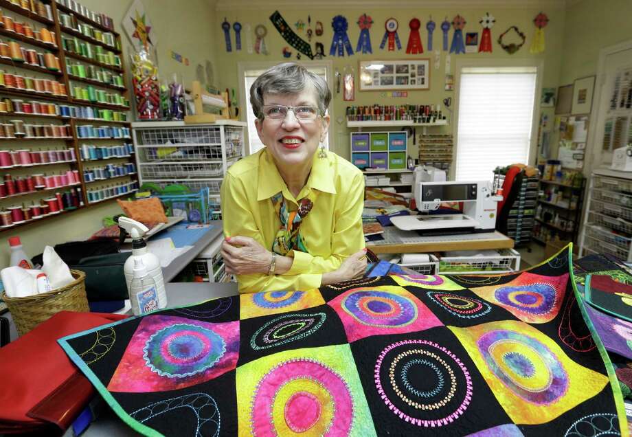
 |
| My photomosaic quilts set up for taping |
 |
| A reminder for the hosts: the guest's name and the gist of the interview taped to video equipment |
 |
| Right before taping...talking about my upcoming segment with Ricky Tims |
Some Observations:
1. No taping is without its challenges...
At 8:00 AM, the setting on the patio was idyllic: cool temperature, lush
greenery; birds chirping in the background, leaves rustling in the
breeze .
By 10:00, a different story: still air, hot
and muggy (plus heat from the lights); the whir of leaf blowers and the
screeching of chainsaws.
We stopped multiple times to wait for a pause in leaf blowing or to reshoot a section drowned out by the chainsaws. And we also stopped for little "blotting" sessions. (confession: I turn red and "glow" on my face when I get hot...so those pauses were mostly mine; I gave up on my hair...which began to look poodle-like.)
2. It's all about the people...and they were warm, welcoming, and wonderful. What you see on air with Alex and Ricky is exactly how they come across in person. And the folks surrounding them (Shelly, Lilo, Gregory, and John) are equally gracious, helpful, and encouraging.
A
quick story: I followed Lyric's very professional taping and felt
a little nervous as Ricky and I were about to start mine. I turned to
him and joked "Well, now it's time for amateur night at the Roxy." He
turned to me, looked me straight in the eye and pointed to himself, "If you look like an amateur, then it's my fault...just follow my
lead and you'll do great." What a gracious thing to say.
3. When I was first approached about doing the segment, I had long conversations with the show's extraordinary producer, Shelly Heesacker. At one point she asked me this: "What would YOU like to get out of this...do you want to do more trunk shows and lectures, have more commissions?"
I gave it a lot of thought. Trunk shows, lecture gigs/teaching, and commissions would certainly be lovely. However, what I REALLY wanted was the adventure of being on the show, getting my own behind the scenes view of the people and the process, and having some good stories to remember and tell.
Mission Accomplished....
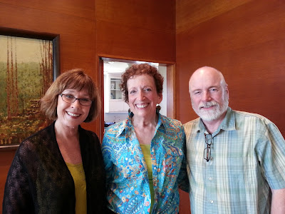 |
| Alex, Debbie, and Ricky: It was a wonderful adventure |
PS: It helps to have someone taking photos. All photos: Joal Fischer


